| 1614 Views | Amin

Most companies may not know this, but data ranks among every organization’s most valuable assets. Also, given the current digitalization of many economies, data has become even more relevant in charting the course of business growth and advancement. Organizations who do not place a premium on their data management and analysis will most likely be trampled upon in competition or not make the most of their resources.
One fundamental reason data is essential for the growth of every business is its place in decision-making. Accurate data can be used to analyze the progress trend, and further predict the future of a business. If your company will make profitable decisions about your customers, internal operations, finance, and employees, then your data must be appropriately managed and analyzed. Unfortunately, most businesses fail to realize this. A whopping 90% of micro-businesses and startups fail because they make business decisions using their experience and instincts instead of relevant business data.
On the other hand, high-flying companies like Amazon, Walmart, and Netflix can predict their customers’ product and content patronage based on data from each customer’s history. Overall, systems like this usually set companies on their way to becoming 19 times more profitable than their counterparts.
However, using data for critical decision-making cannot be possible if data is inaccessible or counterintuitive. Data analysts, board members, and frontline employees can only make the most of data they can easily reach, navigate and understand. Therefore, this article will point you to critical reasons your data needs to be user-friendly.
After collecting data via your auto web activity tracker, ticketing system, or lead import system, why is it essential for your business data to be intuitive?
Easily Accessible Data Can Be Used To Drive Automation
When your business data can be easily analyzed and used, you can easily set up specific automation that can improve your business’s efficiency, customer engagement, and growth.
Intuitive Data Is Cost-Effective
When team members spend more time accessing data than is required, you’ll incur additional costs on your business. For example, information that needs internet access to be reached will cost you more in terms of data if it is counterintuitive. If you also use a data management solution that requires a time-bound subscription, non-friendly data structures will have you paying more for such subscriptions.
Do not forget the cost of training your frontline employees when they have to access data whose structure is beyond their portfolio. If your data structure was initially designed to accommodate the expertise of your front liners, this training cost could be channeled to other growth-stimulating aspects of your business.
It Saves Time
Intuitive business data ensure those team members who depend on business data to function do not spend more time than is necessary on a given set of data. This also means that these persons will focus on other essential activities within the company, and data-dependent projects can be completed on time.
Intuitive Data Maximizes Efficiency
When your data is not user-friendly or can only be accessed by executives, you slow the progress of your business. This lag may result from the fact that some employees or departments could have their work a lot easier if only they had access to relevant data. And when you consider the fact that these frontline actors will need to pause their work until the ”executives” – who are more likely than not to be busy – revert to them.
For one thing, this waiting time can slow down efficiency. There is also a tendency that the ”executive” – who has exclusive access to data but is not specialized in the department in need of the data – may provide incomplete, inaccurate, or irrelevant data.
On the other hand, data that can easily be accessed and understood by frontline actors can drive efficiency and productivity. Data quality and accuracy will also not get affected when it does not have to go from one desk to another before reaching relevant actors.
Intuitive Data Drives Decision-Making.
When top-level managers, decision-makers, and frontline employees in an organization can easily access and analyze relevant data, better business decisions will be made. And every business is bound to experience advancement when strategic decisions are made using up-to-date data.
Tips for Making Data User-Friendly
So, have you discovered that your data and its structure might be causing your business some form of harm? Or do you hope to imbibe a culture of intuitive data right from your first day of business? The points below can help you manage your data in a user-friendly manner:
- Employ advanced technology when dealing with voluminous data.
- Use an intuitive data management system design.
- Make data structure easy to navigate.
- While preparing data, but its users into consideration.
- Make good use of lists.
- Categorize extensive volume data, and make each category collapsible.
- Use visual tools, and make them interactive.
How EMCsoft Makes Your Contact Card Intuitive
Having known the importance of making your business data intuitive, you can make that bold move in making necessary changes to your data structure today. Reach out to EMCsoft, and you’d be amazed at how much your business would grow by the simple act of structuring your Bitrix24 CRM data more intuitively.
In our most recent development, we helped a client improve the intuitiveness of their Bitrix24 contact detail by categorizing their contact information. After this categorization, we ensured that each category could be collapsed and expanded.
Companies that process extensive volume details will no longer struggle to access relevant information from their Bitrix24 CRM with this development. This development also eliminates the struggle of scrolling through a large amount of data to find what you’re looking for within your company’s contact card.
The illustrations below show how this development works:
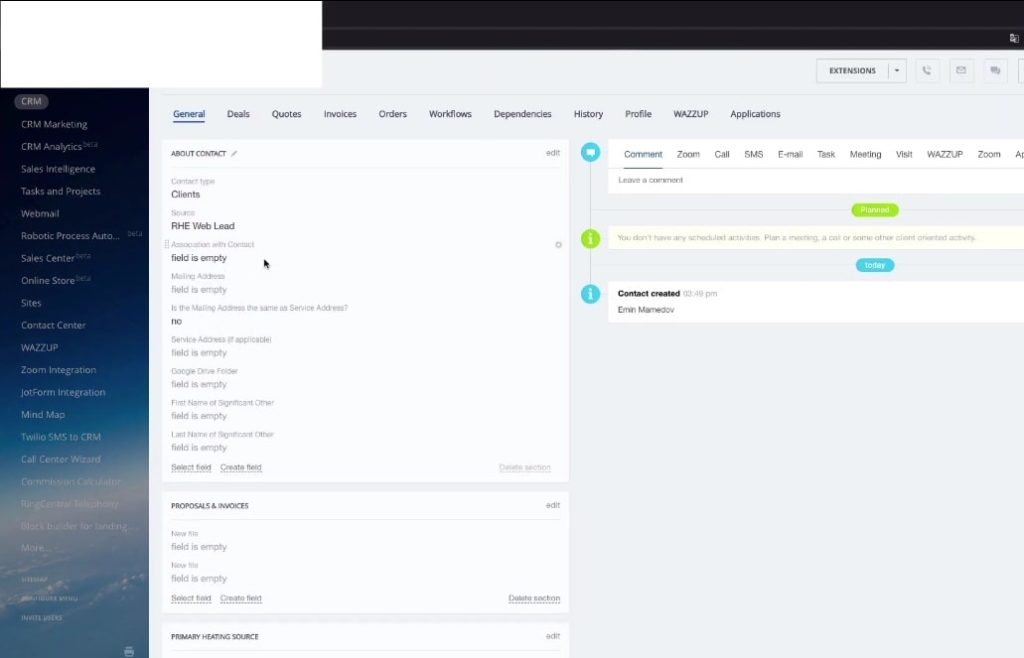
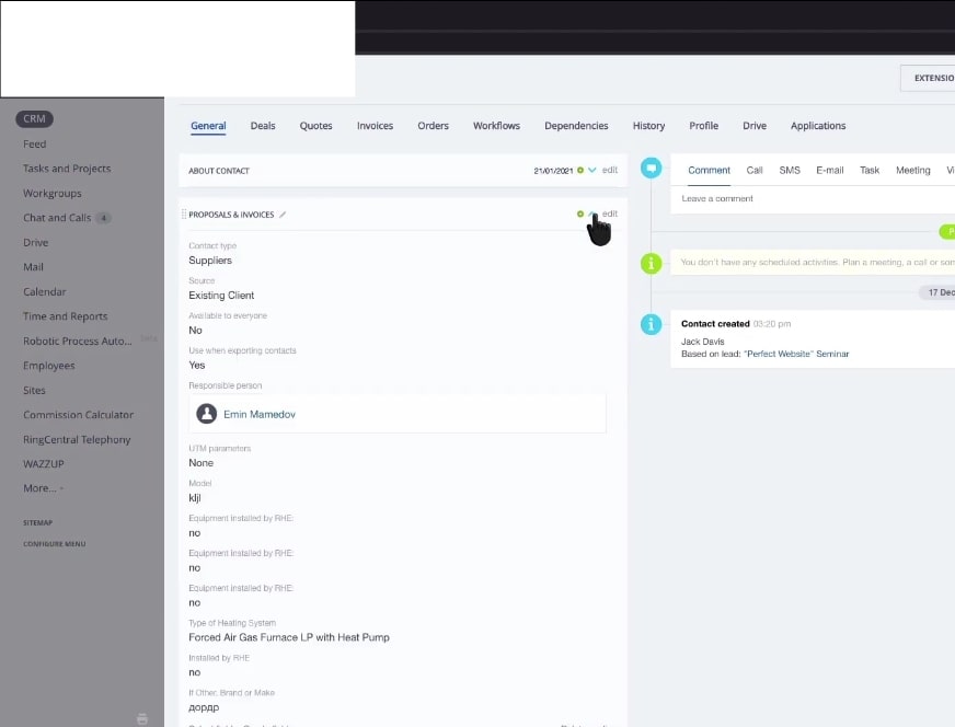
1. Inside the Contact, this particular client created many sections. However, his agents always have a problem accessing information from the contact card since they practically need to keep scrolling up and down the page to find what they want.

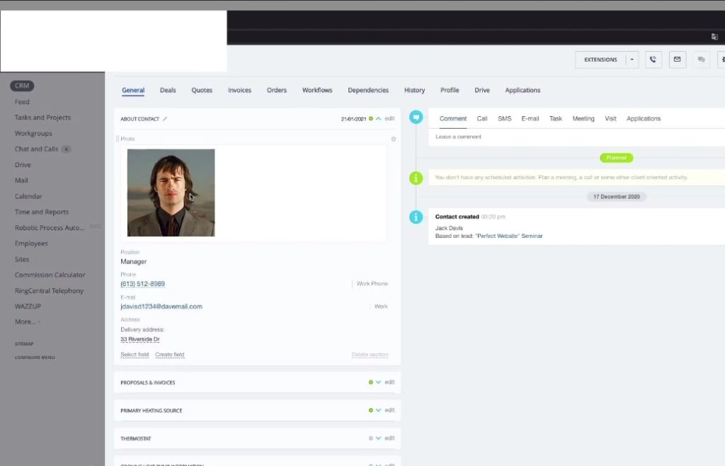
2. Our development saw that our client could collapse each section he creates in the accordion display.
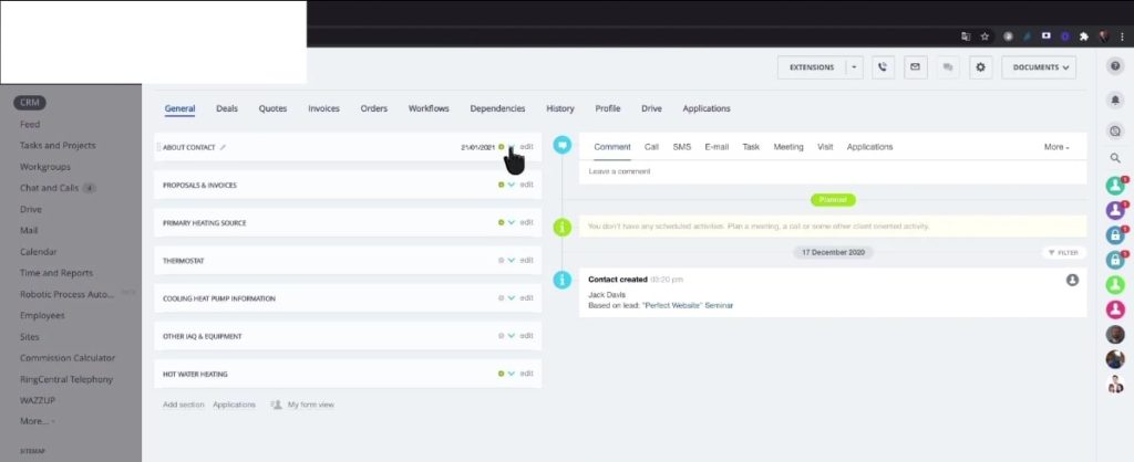
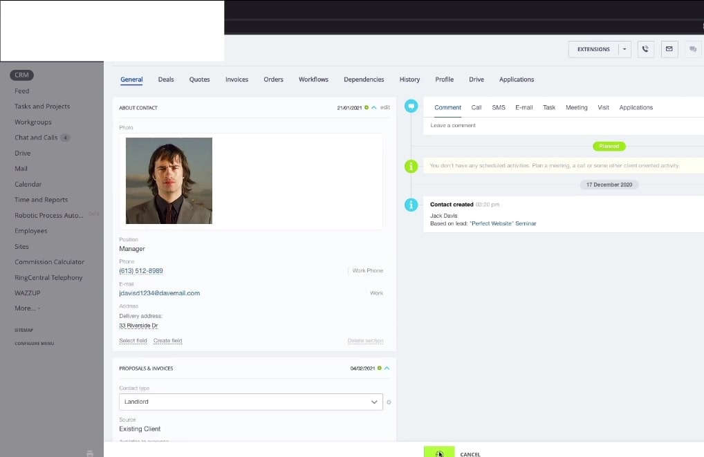
3. When you carry out any edit on the contact card detail, the editing date is shown on the list for that category.
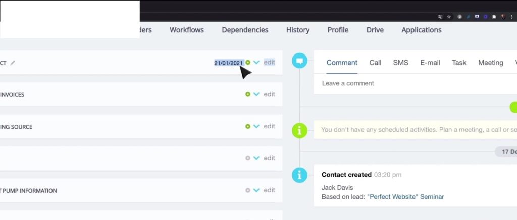
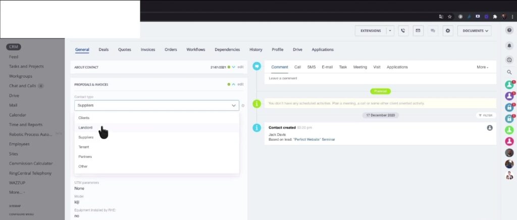
4. For example, change the supply type and save when you go to the proposals and invoices.
5. Upon collapsing the proposal and invoices section, the date you made the change appears on the collapsed list.
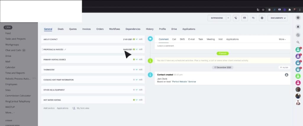
In a nutshell, by collapsing your data category on the Bitrix24 contact card accordion display, managers and data users can save much time and improve efficiency.
“Contact us today. Let’s make your Bitrix24 data as user-friendly and efficient as it can be!”
